The complete visual identity for commonladder.org — logo, color, type, voice, and how to apply the brand across web, print, social, and beyond.
Version1.0
Last updatedMay 2026
MaintainerCommon Ladder team
01 — The brand in one paragraph
Common Ladder is a civic resource platform.
It connects people experiencing homelessness, the case managers and nonprofits who serve them, government agencies, and donors. The brand reads as civic, warm, plain-language, and dignified — not corporate, not bureaucratic, not charity-coded. Every visual choice in this guide is in service of that posture.
Three meanings in the name.Ladder — upward movement, step by step. Common — shared ownership, the civic commons. Together — stability and housing as collective achievement, not individual charity.
Lead tagline:"Every rung, together."
02 — Logo
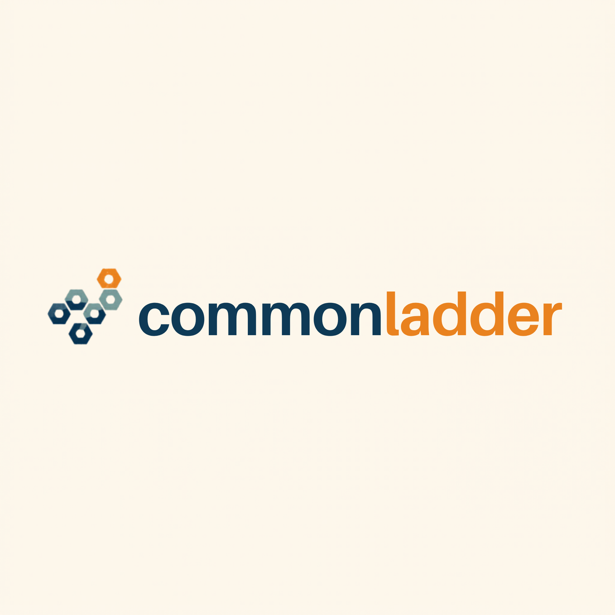
The lockup
The logo pairs a three-hexagon rising mark with a lowercase two-color wordmark. The hexagons step from Ladder Blue through Resource Sage to Rung Amber — left-to-right, low-to-high — visualizing collective progress through the civic commons. The wordmark sets common in Ladder Blue and ladder in Rung Amber, with no space between, so the two ideas read as one word.
Primary lockupUse on Commons White, pure white, or very light backgrounds. This is the default everywhere.
Reverse lockupUse on Ladder Blue, deep neutrals, or dark photography. The bottom hexagon flips to white; "common" flips to white; "ladder" stays amber so brand recognition carries.
Mark onlyFor favicons, social avatars, app icons, watermarks. Use when the full wordmark would be illegible or visually noisy.
Mark only, reverseSame as above on dark surfaces. Bottom hex switches to white.
Clear space
Always leave a clear margin around the logo equal to the height of one hexagon. Don't crowd it with type, photography, or other graphic elements within that zone.
The amber dashed outline shows the minimum clear space — equal to one hexagon height (≈ 48 px in the master file).
Minimum sizes
The wordmark must remain legible. Don't render the full lockup below 120 px wide on screen or 1 inch (25 mm) wide in print. Below that, switch to the mark-only icon.
320 px — full lockup
180 px — minimum recommended
64 px — mark only
32 px — favicon floor
03 — Logo do's & don'ts
Use the logo with confidence.
The logo is the single hardest-working visual asset Common Ladder owns. Protect its proportions, its colors, and its breathing room.
Do
Primary lockup on Commons White or pure white.
Do
Reverse lockup on Ladder Blue or other dark fields.
Don't
Don't place on washed-out or mid-tone backgrounds where the blue collapses.
Don't
Don't lay the logo over busy patterns or photography that fights with the mark.
Don't
Don't rotate, tilt, or "make it dynamic." The lockup is horizontal.
Don't
Don't stretch, squish, or otherwise distort the proportions.
Don't
Don't recolor the mark or wordmark to off-brand colors. The palette is the brand.
Don't
Don't add a space between "common" and "ladder." They are one word.
04 — Color
A small, intentional palette.
Two colors carry the brand. A third supports. A neutral grounds it. Use this palette confidently and don't introduce ad-hoc accent colors — restraint is part of the brand's posture.
Ladder Blue
HEX
#1C3D6E
RGB
28 / 61 / 110
CMYK
91 / 75 / 22 / 5
Primary · headings · nav · logo anchor
Rung Amber
HEX
#E8911A
RGB
232 / 145 / 26
CMYK
5 / 47 / 100 / 0
Action · CTAs · highlights · upward moments
Resource Sage
HEX
#4A9E82
RGB
74 / 158 / 130
CMYK
71 / 13 / 56 / 0
Category tags · health · success states
Commons White
HEX
#F8F7F4
RGB
248 / 247 / 244
CMYK
2 / 2 / 4 / 0
Background · warm off-white (not clinical)
Body Ink
HEX
#1A1F2B
RGB
26 / 31 / 43
CMYK
87 / 78 / 60 / 86
Body copy on light backgrounds
Amber Dark
HEX
#b36a00
RGB
179 / 106 / 0
CMYK
21 / 64 / 100 / 9
WCAG-safe amber for text on white
Important — contrast rule: Rung Amber and Resource Sage both fail WCAG AA contrast against white. Use them only as button fills, badge backgrounds, or icon accents — never as body text on white. When you need an amber for text on a light background, switch to #b36a00 (Amber Dark) — the approved accessible fallback.
05 — Typography
Two typefaces. Many voices.
Manrope for display (headlines, the wordmark, key UI). Inter for body (paragraphs, labels, lists). Both are open-source, free for commercial use, and load cleanly from Google Fonts. No third typeface — restraint again.
Body — Inter 400 — the default text style for every page
Common Ladder is a civic resource platform. We help people experiencing homelessness, the case managers and nonprofits who serve them, government agencies, and donors find each other faster. No accounts. No data sold. Everything plainly explained.
Common Ladder serves multiple audiences in one breath — someone seeking help tonight, a case manager mid-shift, a city director, a donor reviewing impact. The voice has to land for all of them. Plain words. No jargon. No charity-savior framing. No bureaucratic stiffness. Treat readers as adults navigating a hard system, because they are.
Do
"Call 211 — they know which shelters have beds tonight. If one's full, ask them to make a warm referral to the next one so you skip the line."
— concrete, useful, treats the reader as capable.
Don't
"Individuals experiencing housing insecurity should leverage available coordinated-entry resources to navigate the continuum of care."
— bureaucratic, distant, hides the help inside jargon.
Do
"You don't have to start over at every door. Always ask: can you call ahead for me?"
— actionable, conversational, gives a sentence to actually say.
Don't
"Empower yourself by advocating for warm hand-offs across service providers."
— preachy, abstract, "empower" doing all the work and saying nothing.
Do
"Built in Phoenix · Free to use, always."
— specific, honest, no promises beyond what we can keep.
Don't
"Empowering communities nationwide through innovative solutions."
— could be any nonprofit anywhere doing anything.
07 — Sample applications
The brand in the wild.
How the system lands across the surfaces Common Ladder actually ships to: web header, business card, social post, printed handout. Each example uses only the assets on this page.
Web · homepage header
For providersLearnAbout
Find resources
Every resource. Every next step.
Find shelters, food, healthcare, and housing programs near you — free, in plain language, no account required.
Lose your ID? Here's the order to recover it — without an address.
commonladder.org
A Phoenix-specific plan for the 72 hours between intake and a bed.
commonladder.org
Print · case-manager handout (US Letter)
Maricopa · One-pager
Stay-Housed Navigator — for households at risk of eviction
If your client has received a 5-day or pay-or-quit notice, route them here today. The navigator screens for the seven Maricopa rent & utility programs and outputs an ordered call list with the right intake hours.
All brand assets are vector SVG files maintained in the public repo. Always pull from there — never re-create the logo by hand or export it from a screenshot.
📎 logo-primary.png — full honeycomb lockup for light backgrounds
For raster exports (PNG, JPG) at specific sizes for print or social, open any SVG in a vector tool (Figma, Illustrator, Inkscape) and export at the size you need. The vector source ensures crisp output at every scale. To download a PDF of this guide, use your browser's ⌘ P / Ctrl P print dialog and choose "Save as PDF."
09 — Changelog
Version history.
v1.0 · 2026-05-31 — Initial visual brand system: civic-grid logo (3 rising hexagons + lowercase two-color wordmark), primary + reverse lockups, mark-only variants, full color palette with WCAG-safe Amber Dark fallback, Manrope display + Inter body type stack, voice principles, do's & don'ts, sample applications across web / print / social.